The Cat is Out of the Bag: The NEW Cat Wisdom 101
We have a brand new magazine look and you can help make it better. Mouse over the images to reveal text. The design is responsive to adjust to size screen or digital device. Please take the poll and vote for what you’d like to see more of. We’re trying out a clean look with no sidebars and placing ads and widgets in the footer with future ad space in a banner above the content. Would you prefer sidebars? One, two or none? Any and all suggestions are welcome.
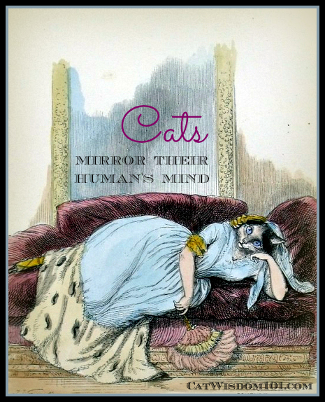
Blogging can be exhausting. Excuse me while I put my feet up and dream of what comes next. Our Etsy shop of our original images and exclusive vintage art like this…or ? All I know for sure is I’d like to come back in my next life as one of my pampered cats.


23 Comments
Alana Grelyak & Crepes
OH my! This looks amazing! We just stopped in to say hello and that we left you something on our page today. But what a surprise!! Beautiful work. – Crepes.
Brian
WOW, looks might fine!!! I had a hard time with the light green on my iPad but other than that it rocks!
Skeeter and Izzy
We think its nice but we so need da boys back too! The green can be a little hard to read for us folks with shall we say,”challenged” vision MOL… Luvs Skeeter and Izzy >^..^<
Chris Davis
This is gorgeous, Layla!
Jobi and Fisher
Very nice, Layla! You definitely deserve feet up and good dreams.
Deb Barnes - Zee and Zoey
Very nice, Layla! I like having everything non-post related at the end of the blog. Very clean and simple. The kitty wallpaper background is cute too – agree with some of the others though, would like a glimpse of the feline 101 gang that we know and love so much in the header.
Concats to a new look and a new year!
Abby
Mom is into minimal.
That’s why she has my blog as she does.
This looks great.
Penelope
I like it!
Kisses
Nellie
Tamago
Wow I love your new look very much!! It is really like beautiful magazine. I like ads etc in the footer. It looks better this way.
The Island Cats
It iooks fabulous! We need to revamp our site now. 🙂
Sue Brandes
I love it! I am not fond of sidebars either. Very clean.
The Musings Of A Crazy Cat Lady
The new look is beautiful, Layla. Please kiss the boys for me.
Bernadette
It’s wonderful, Layla! I know how much work went into this! I’m not fond of sidebars myself, I think they are distracting and prefer the clean look. I would so love to see one of your wonderful photo collages of the boys somewhere!
da tabbies o trout towne
.we loves de new look, itz kleen N fresh but we miss see inn domino N gris N merlin N odin..
how bout a banner like
domino gris layla merlin odin
ham samiches on de side wood be nice two with friez N donuts…ore cake
Christine
No sidebars…more kitties.
Caren Gittleman
I think it looks fabulous, I am with Sparkle though, while I love seeing your beautiful face I think the cats should be the emphasis 🙂
Pam and Sam
Love the new look! Can’t make ANY suggestions although if you had “the boys” at least in miniature on your banner with your beautiful picture it might be nice!
Hugs, Pam (and Sam)
CATachresis
WOW! This is a proper makeover!! Very comprehensive. You should charge for tours 😉
Kathryn
This is fantastic and looove your vintage card!
Your etsy shop must be great.
Sparkle
I think it looks great! Although I think the kitties need to be in the header!
TXMadCatter
Looks great!
Cynthia Southern
I love it. 🙂
Glogirly and Katie
Looks wonderful, Layla!
Congratulations!
: )