The Poetry of Shelter Cats
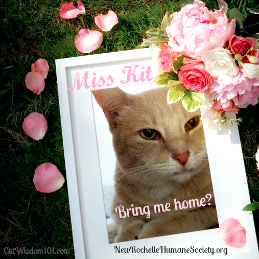
This week from my shelter volunteer notebook, I’d love your opinion about styles of Adoption PSAs. We know cats are poetry in motion, inspiring writers, poets and artists. They certainly inspire me to photograph and make adoption graphics. But some are more successful than others. Do you like: 1) Simple round ones like the one below?
2) A image with text telling a story?
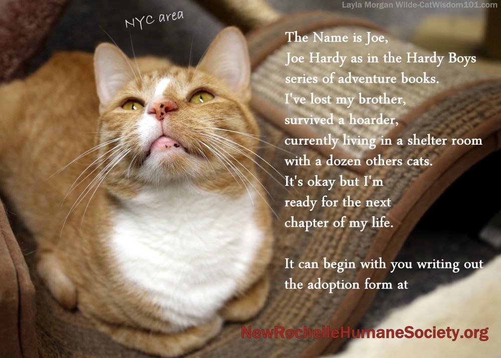
This is Joe Hardy who was rescued in June from a hoarder. His cage-mate bro and muse died (see above). Joe found a temporary foster and blossomed but vacation plans resulted in his return to the shelter. The good news is he’s in the large cage-free room but he looked sad and unhappy when I saw him two weeks ago. He would not look me in the eye and knew who I am: the one who always opened the cage door to let his friend out to play and cuddle with while he refused to come out. And now he’s gone. He’s been through so much, I’d to see him in a permanent home.

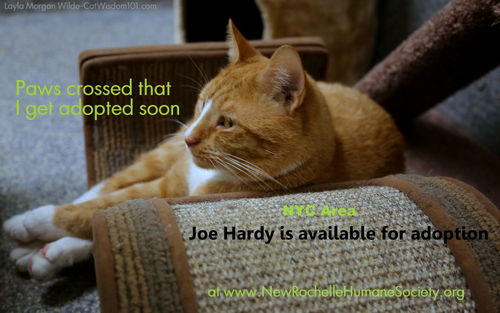
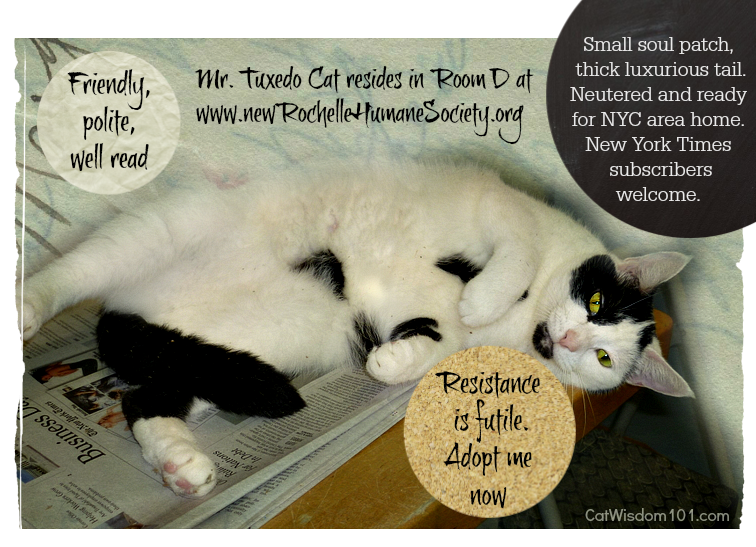
3) Cute caption with minimal text?
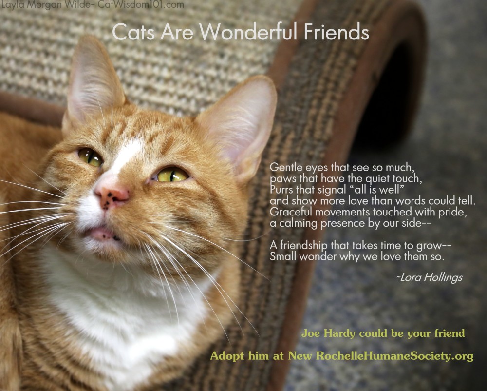
4) Image with a quote or poem?
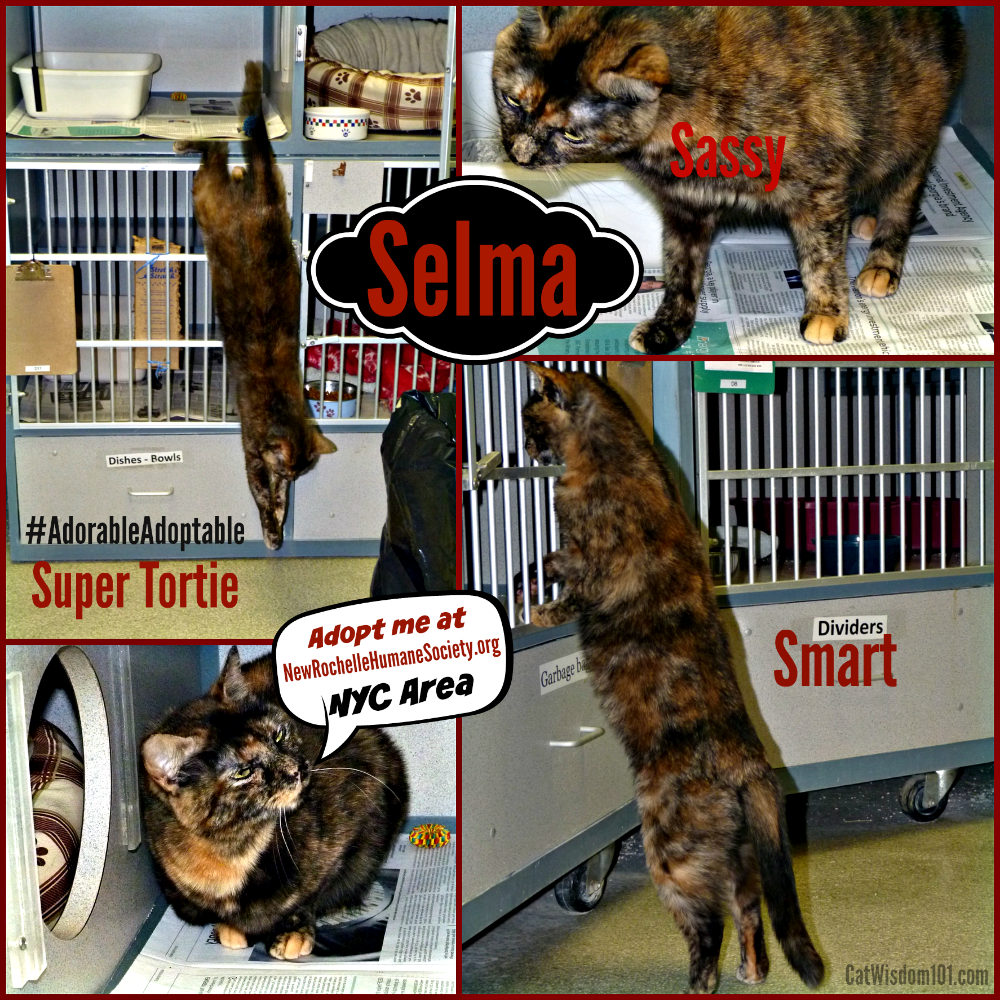
5) Image with text captions and lots of white space or cartoon bubbles?
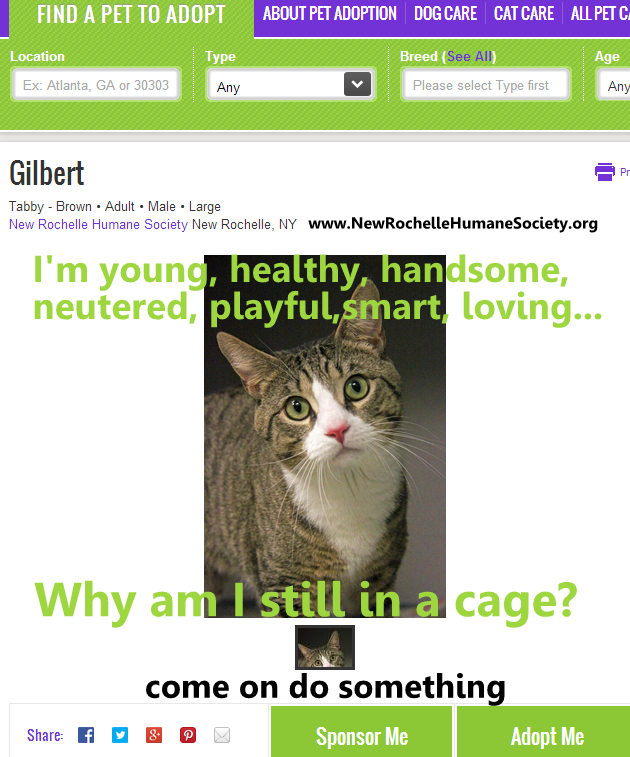
Yes, this is Gilbert our feature spotlight again! Two weeks ago, I walked into a back room and saw another cat in his cage. I hoped for the best. I asked a shelter worker where’s Gilbert and he said he’s adopted by someone in a big mansion. Naturally I’m thrilled until I walk into the bigger but windowless room of cages and spot Gilbert. My heart sank. I guess I didn’t get the joke. He was miserable. I opened the door and he bounded out like what took you so long. With extra new kittens, another worker said he couldn’t be taken out of the cage. Back inside he went and we both felt like crap.
He’s probably one of the most purrfectly adoptable cats but his patience is wearing thin. This the link to his Petfinder profile to share, adopt or sponsor. All the images can be Pinned or shared. This is the link to New Rochelle Humane Society Thanks for sharing and telling me which style adoption PSA you think would be most effective.
 [Tweet “Which cat adoption style of #adorableAdoptables graphic do you prefer?”]
30 Comments
fpcywkazhf
xaedbadwjdhwmlkhxmejmqwfcjfxux
Cynthia Southern
I really like 2 and 5. I love Joe, He is a beautiful orange kitty. I hope he is adopted soon! Gilbert looks like my Queenie. I love brown tabby cats too.
maggie
I like minimal text- the paws crossed with caption is enough to get my attention and help me decide if I want to know more. While the poem is very nice I wouldn’t be swayed toward that cat because of it.
I went back to read the poem, but skipped right over it the first time!
To me it’s almost all about the pictures- and you take excellent ones.
Skeeter and Izzy
We like 2 & 5. It really depends on the site that you might be working with but in our opinion the photo MUST be excellent! A picture is indeed worth a thousand words! We like the story to give important background too. I think the style should suit the photo. I think that the pic will speak to you about how to “frame” it.
Luvs,
Skeeter and Izzy and the Feral Gang + Twig & Peanut & Romeo >^..^<
Deztinee High
Purrsonally weez luv to see a good foto of da kitty and weez like when da kitty is askin’ to be adopted. It tends to tug da heart stwings mowe than anyfin’ els. Weez kuldn’t figger out yous nummer system, sowwy but weez told yous what weez like to see. Most of ow furiends like dat too.
Luv ya’
Dezi
Cathy Keisha
2 or 3. Definitely not the poem but that’s JMSO.
Flynn
They are all very good, but I like #2 the best.
Elizablest Moonrose
Love 2) A image with text telling a story, because that’s how I “roll”. But sure like the poem one too.
Nerissa's Life
Hmmm… Number two OR three. Depends upon the story. Depends upon the picture. Probably, for every cat, it’s different. No one nip-mouse fits all, kind of thing.
Purrs,
Nissy #Niss4Senate – tell the PM, today.
The Island Cats
We kinda agree with Sparkle. A great photo and minimal words…but something that will grab people. We like #5.
And we love the freckles on Joe’s nose. 🙂
Angel AbbyGrace
Everyone will probably like something different.But we like #2 best. And btw we liked all of them, just #2 the best.
The Swiss Cats
#2 and #5 are our favorite, mostly #5 : you know a little something about the cat, and it was the most touching “call to action” for us. Purrs
CatInTheFridge
We like 2! It gives the story of the cat and that’s always worthwhile! As long as the photography is sharp and gets a good image of the cat’s eyes looking at you like in the last one, I think you’ll do well with any of the styles. They all appeal to different people. 🙂
Layla Morgan Wilde
Thanks, Bev, and it is marketing. Everyone from the ASPCA to small rescue organizations do it but some do it better.
da tabbies o trout towne
doodz…we vote for number two; it tells a storee bout de kitteh N inserts
a wee bit oh humor inta it….frank lee de tug at de heart strings sad song
stuff ya see in commercials ore reed about…makes most peepulz flip de channel ///brochure page coz they honestly canna “deal” with stuff like that….then it bee comez money wasted for commercial air time///print that could haz been spent sum place else…we like number three best de next…cute, simple N two de point
N best fishes guys ya finds yur forevers home….reeeeeeeeeely quik ♥♥♥
Layla Morgan Wilde
I agree the really sad images of turn me off too.
Melissa & Truffles
Also, I ADORE your Notes from a Shelter graphic!
Layla Morgan Wilde
Thanks, so much. I was going to change it but maybe I’ll wait.
Melissa & Truffles
My favorites are #2 and #3…people’s attention spans are short and they need to be grabbed quickly. I also love when the adoption quotes are written from the cat’s POV 🙂
Dorothy
There were all good but it was number 5 that got the deepest reaction from me. I wanted to respond to number 5 even though I live 100’s of miles away and already guardian to the maximum number of kitties that I can afford. I suppose the best idea is to survey which method gets a reaction from the most people. For me it’s words but for others it may be one of the other choices. It will be Interesting to know which method reaches the most people.
Layla Morgan Wilde
Dorothy, thank-you. Keep in mind I added the text to the plain Petfinder profile. I wonder if the white space helped it pop or the words.
Fuzzy Tales
#4 and #1 are my personal favourites, but realistically, I think there needs to be info about the cat up front, something to catch the potential adopter’s eye. Well, superb photos like these are a HUGE help, nothing like the crappy photos posted in our area’s shelters.
#2 probably is the most practical, IMO, but with fewer words, if possible. In that one, I would take out the explanation of the name and probably also take out or rewrite the adoption form info. Make a URL clickable, of course. I *would* indicate he was from a hoarding situation and has lost his brother (poor sweetie), as that definitely will tug at heart strings.
Sparkle has the right of it, IMO. Good suggestions from her.
Layla Morgan Wilde
Good points. Thank-you!
Sammy
I love images with poems…..they speak to my heart and when people choose a cat to adopt – it’s through their hearts. What a handsome boy Joe is…..those freckles…..Sam has them and I love each and every one.
Pam
Layla Morgan Wilde
That’s true about hearts and the emotional connection.
Sometimes Cats Herd You
We like the words on the second one, especially. As much as the photo on the first one, especially is better, the idea of fewer words, like a billboard, is good, we think, because people have such a short attention span. Where are they going to be used? If it’s going to be in print, you can probably get away with more words, but on the internet, people’s eyes slide right past blocks of text without reading it unless it’s an article or something.
Layla Morgan Wilde
They are social media shared for now and you’re right about limited attention spans.
Sparkle
I will tell you what catches my human’s attention – a clear, well-done photo of a kitty looking at/relating to the camera, a compelling story in as few words as possible, and a video with someone talking about the kitty’s personality. When it comes to a new family member, humans want to know about personality, and they want to fall in love. The artistic details (poems, graphics, etc.) are nice, but should only be add-ons to solid info. That is her opinion – and I will say this approach has caused her to bring kitties to my attention so that I’d blog about them.
Layla Morgan Wilde
So which #? The point of my PSAs is to get attention and then the person can look a profile for details. Videos are great but that’s another endeavor.
Bev Green
All of them are lovely Layla…for me..the image and a poem is the one though….it makes me want to learn MORE about the kitty …poetry talks to me and so maybe this is why…to see an image and read the words makes a big impact..either way I think all people are drawn to different forms of ..and I hate to use the term ..advertising…I mean that in the nicest way possible too..and so maybe it is good to mix it up a bit 🙂 hugs Fozziemum xx